


Med24
Redesigning UK Healthcare’s Digital Experience

Overview
Med24 is a premium clinic in Central London offering GP-led primary care with both in-clinic and virtual options. The client needed to revolutionise the way patients book, access, and engage with healthcare in the UK. Their goal was clear: create a seamless, modern healthcare experience that’s reliable 24/7, easier to book, and accessible online, while also showcasing the professionalism and holistic wellbeing aesthetic of their service.
My role and solution
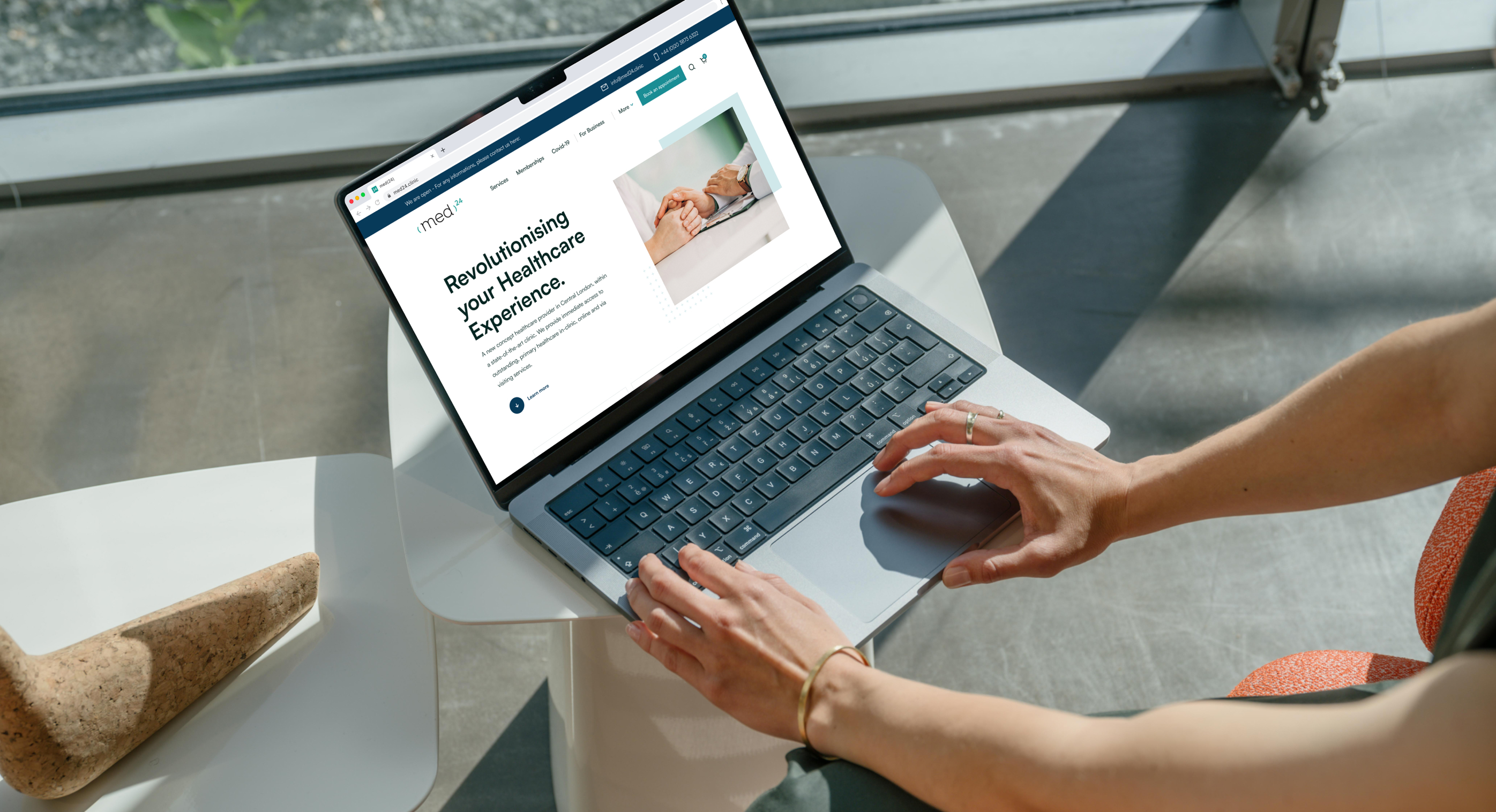
I led the full UI/UX design and took charge of building Med24’s new website in Webflow, from concept through production. I worked closely with the client in weekly meetings to refine every detail and ensure their satisfaction. I redesigned and built the site in Webflow, starting with a comprehensive audit of the existing site and focusing on intuitive navigation, a clean visual language, and a structure that highlights Med24’s professionalism. Along the way, I integrated tools like HeyDoc to support bookings and Jotform for membership purchases to enhance the flow. The result is a clean, polished, conversion-focused website that elevates the Med24 brand and sets a new standard for healthcare access online.
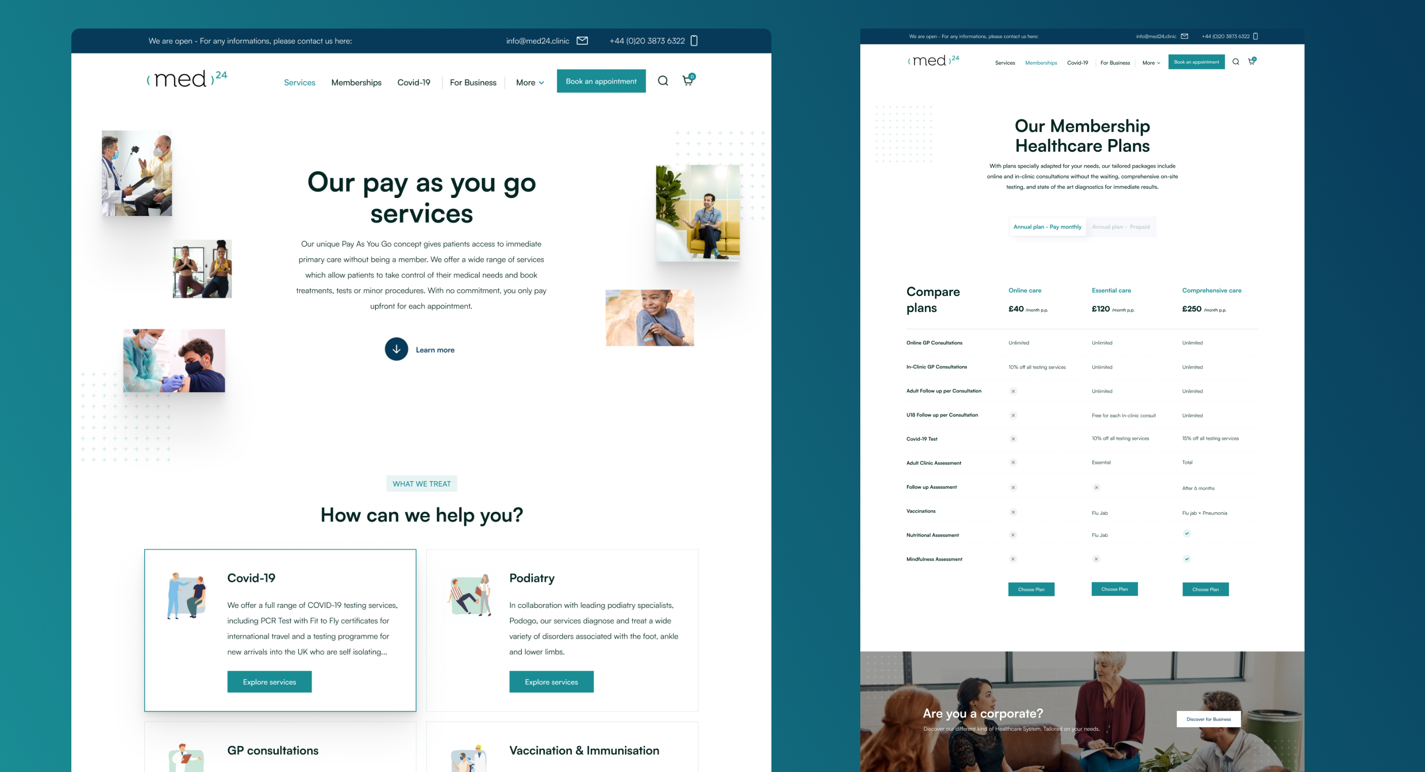
From audit to roadmap: uncovering the gaps in Med24’s digital experience
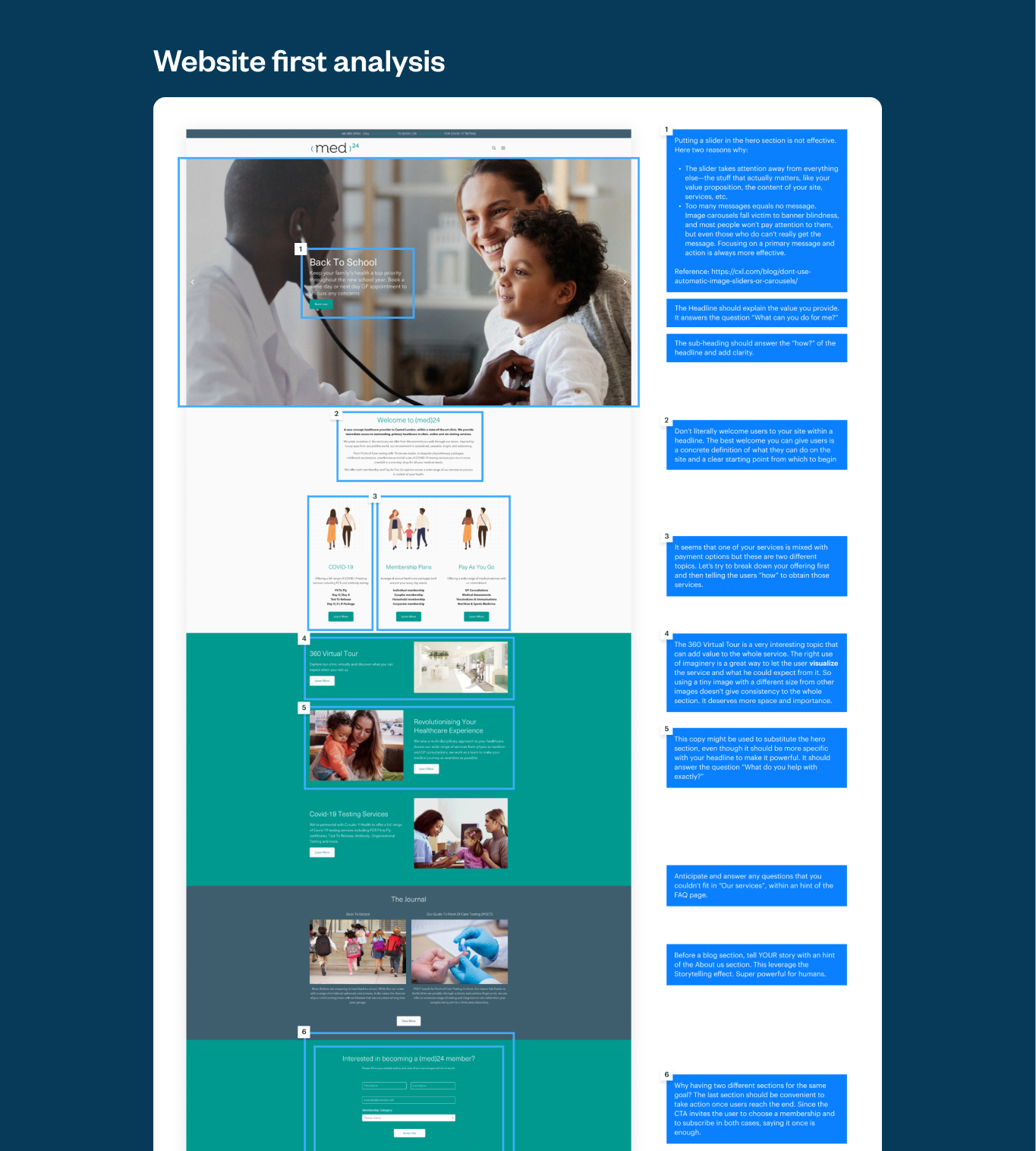
I began with a deep audit of Med24’s previous website, which quickly revealed why patients struggled to navigate their services online. The analysis covered content structure, information architecture, UX and conversion barriers, and mobile responsiveness. By mapping user journeys and highlighting key friction points, like unclear service presentation, a fragmented booking flow, and limited trust signals I was able to define a clear, lean roadmap. This process gave Med24 immediate clarity on their challenges and built the foundation for a complete redesign, convincing them that a new digital experience was essential.
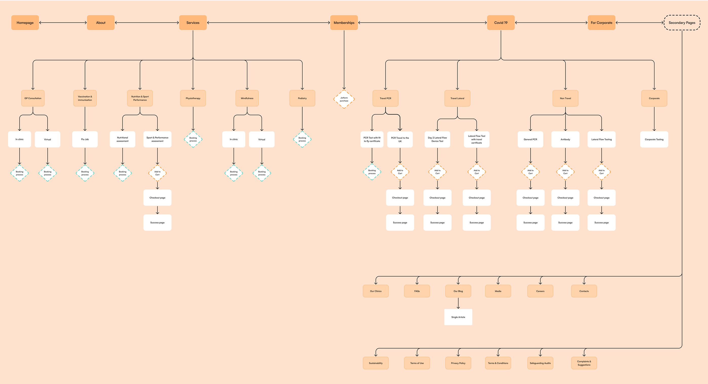
Restructuring the sitemap: redefining priorities and pages
Once the audit was complete, I turned my attention to reshaping Med24’s sitemap. This process was about more than just listing pages—it was about defining priorities. I worked closely with the client to determine which sections carried the most weight (such as services, booking, and membership) and how secondary pages like FAQs, resources, and contact should support them. By curating a clear hierarchy, the new sitemap laid the foundation for a user journey that feels logical and effortless. Patients can now navigate the site with confidence, moving seamlessly from discovery to booking without friction.
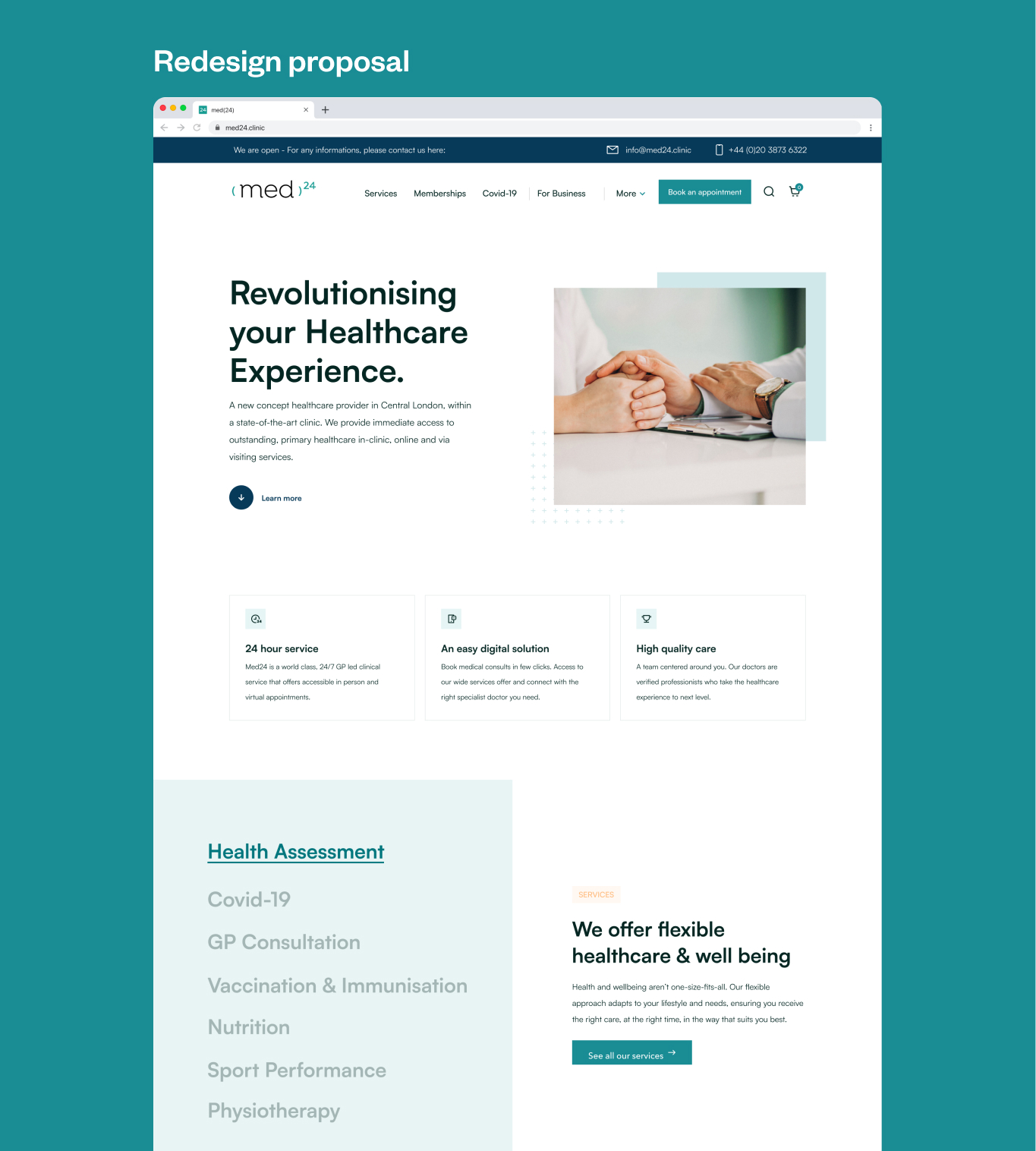
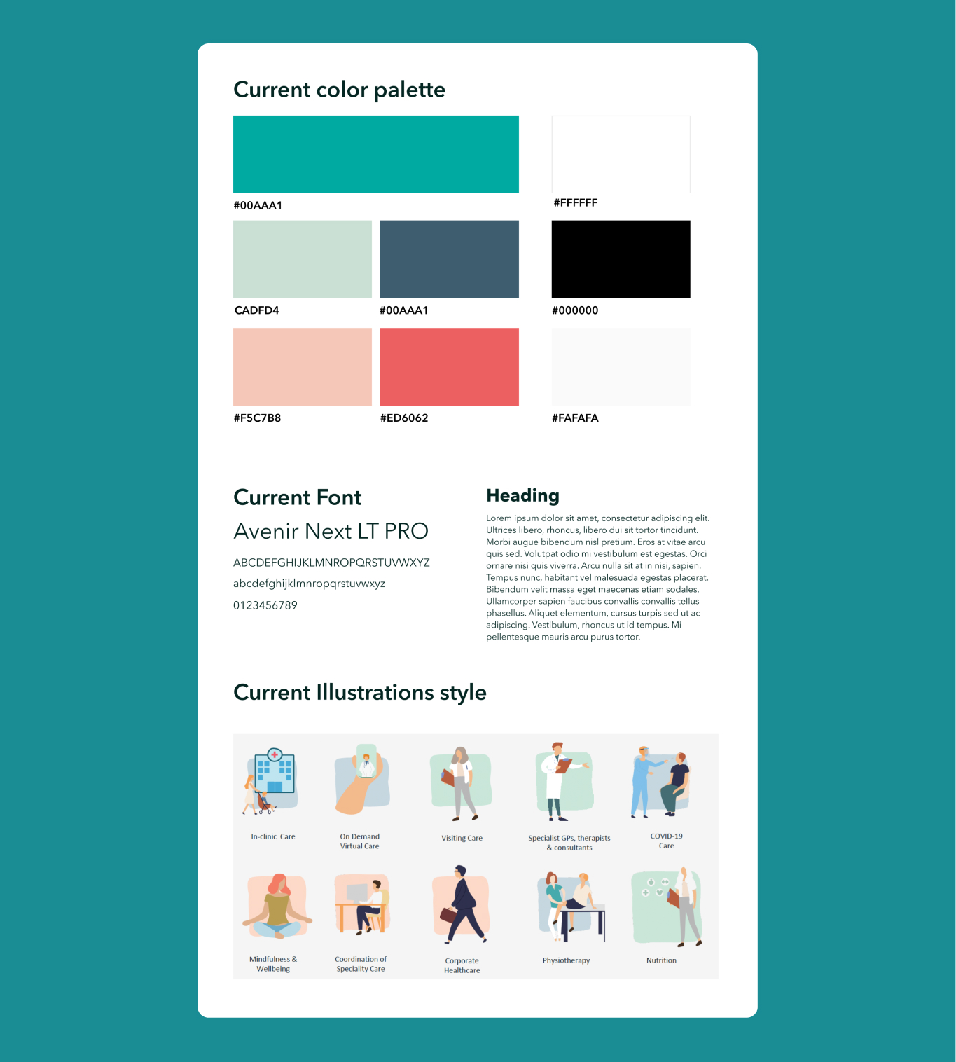
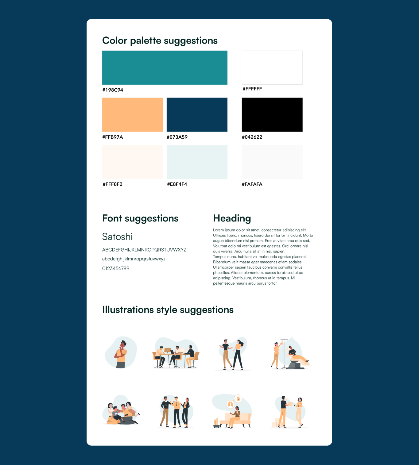
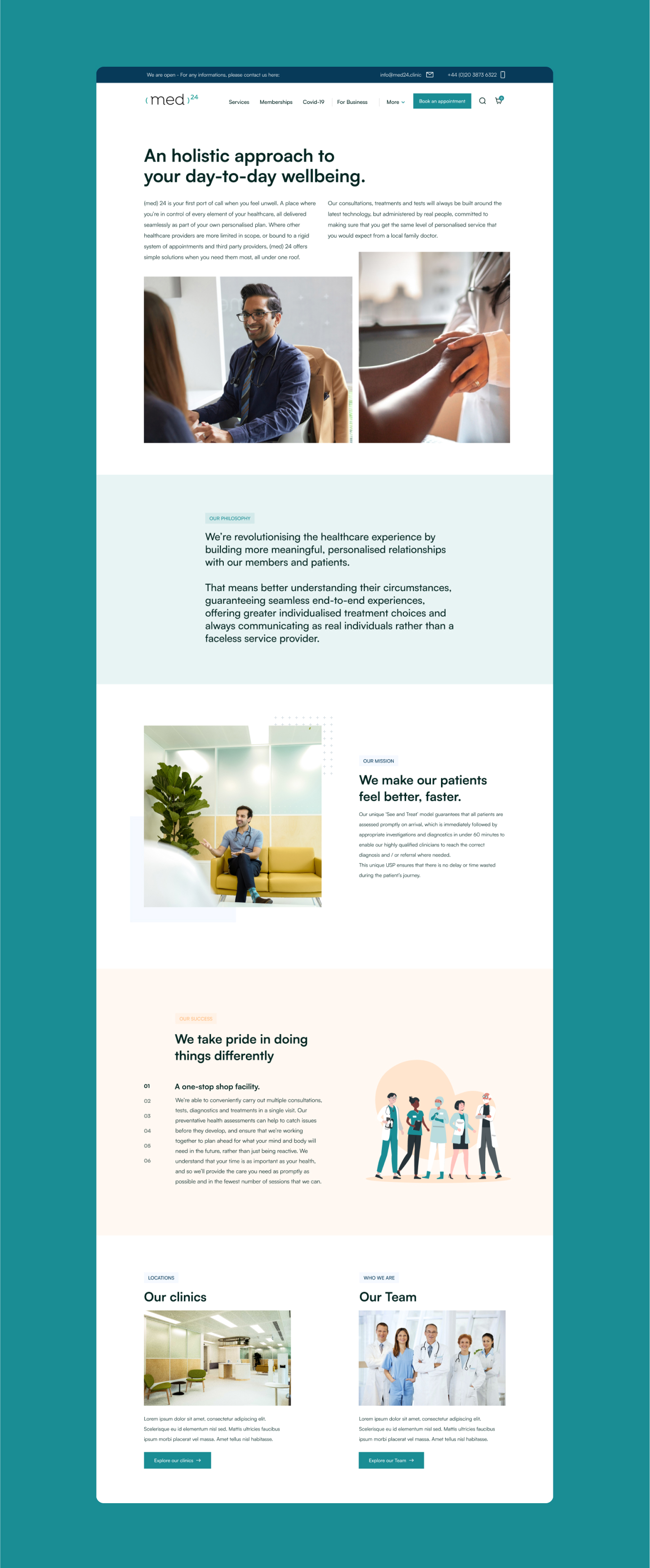
Defining the new look & feel for a faster impact
With the sitemap defined, together with the client, we chose to skip traditional wireframes to maximize the time–effort balance and move straight into the visual restyling. The idea was to provide the client with an immediate sense of how the new look & feel could transform their digital presence, and to gather quick feedback before diving deeper. I started by analyzing Med24’s existing brand assets: the color palette, fonts, and illustration style and reinterpreted them into a cleaner, more cohesive direction., including a prototype to show how the visuals would seamlessly align with content. This first design proposal became the foundation for both the visual identity of the new site and the improved UX, ensuring that aesthetics and usability evolved hand in hand from the very beginning.

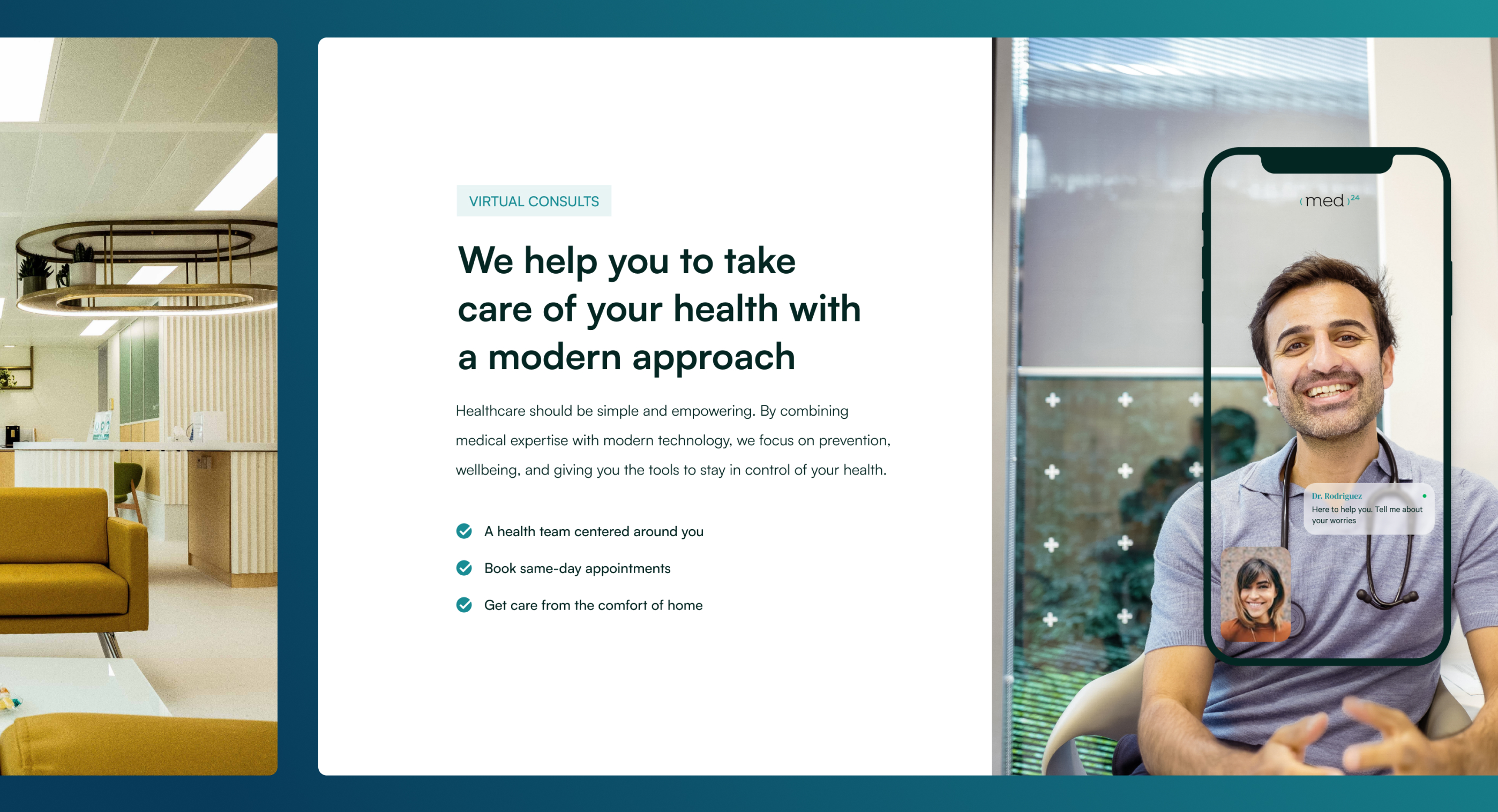
Scaling the UI across the website
Once the new look & feel was approved, I extended the visual language across the entire website. Each section was carefully designed to reflect its role in the user journey, hero areas for strong impact, service pages for clarity, and secondary sections for support without distraction. Beyond aesthetics, my focus was on consistency: building a scalable UI system of components, layouts, and design patterns that could evolve with Med24’s needs.
Crafting the right voice for a holistic experience
For Med24, visuals alone were not enough, the words on the website were just as important. The client wanted patients to immediately understand that their clinic was more than a medical practice: it was a premium, spa-like environment rooted in a holistic approach to health and wellness. Together, we refined the tone of voice to be clear yet inviting, balancing professionalism with warmth. This ensured that every headline, description, and call-to-action communicated not just the services offered, but also the unique atmosphere and philosophy that set Med24 apart.
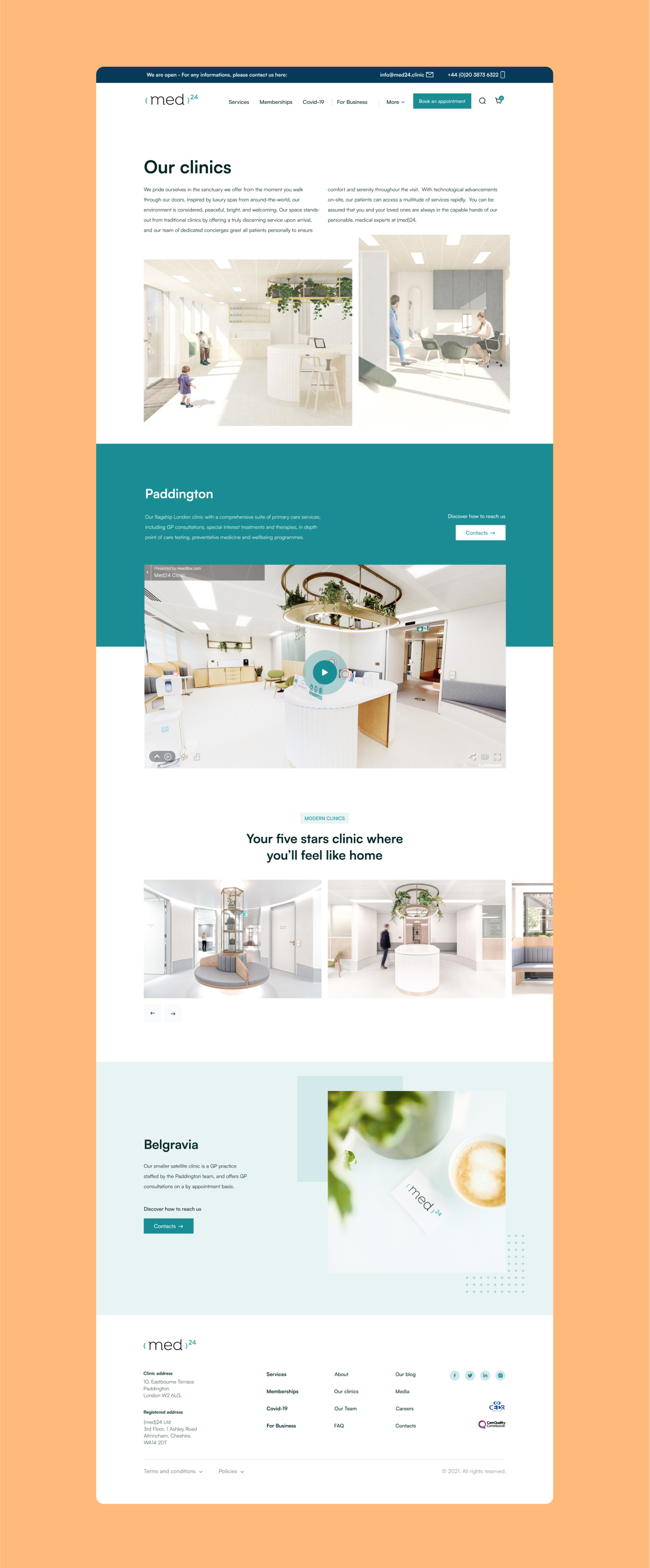
Highlighting services at the core
At the heart of the Med24 website was a clear goal: making it easy for patients to access services and choose the path that suited them best. Whether booking a one-off consultation on a pay-as-you-go basis or subscribing to a membership with exclusive discounts and benefits, the experience needed to be seamless and transparent. I designed the flow to present both options side by side, ensuring users immediately understood the value of each. In the end, the project was a success: the new website not only reflected Med24’s holistic vision but also delivered a clear, intuitive way for patients to engage with their services exactly as the client envisioned.