


Ristoply
Digitizing the HoReCa Supply Chain

Overview
Ristoply is a smart B2B mobile app born from a real challenge in the HoReCa world: restaurant owners were stuck managing supplier orders through emails, WhatsApp messages, or even fax. This fragmented process was time-consuming, error-prone, and far from efficient. The founders, based in Naples, set out in 2021 to transform the HoReCa supply chain with one clear goal: how might we make supplier ordering as seamless and modern as the dining experience itself?
My role and solution
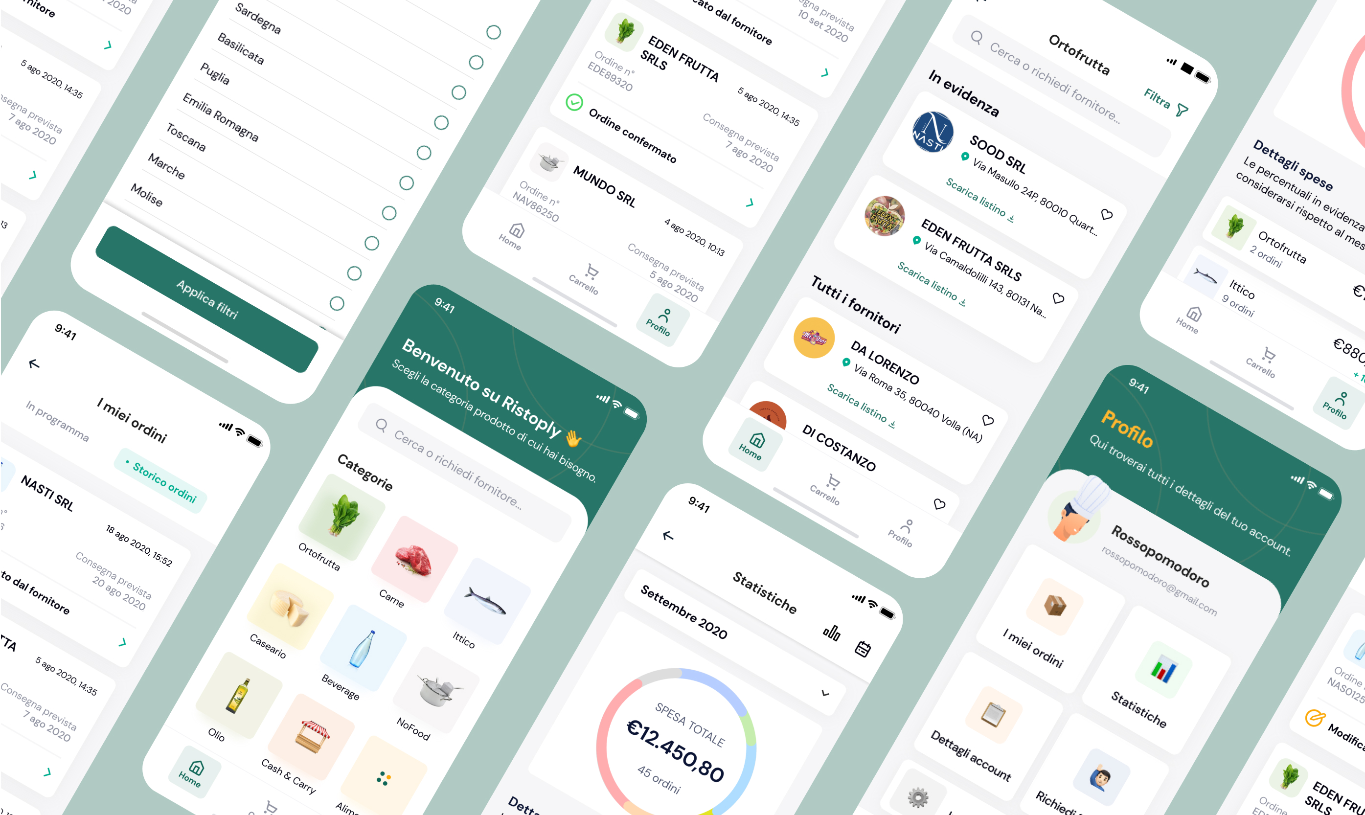
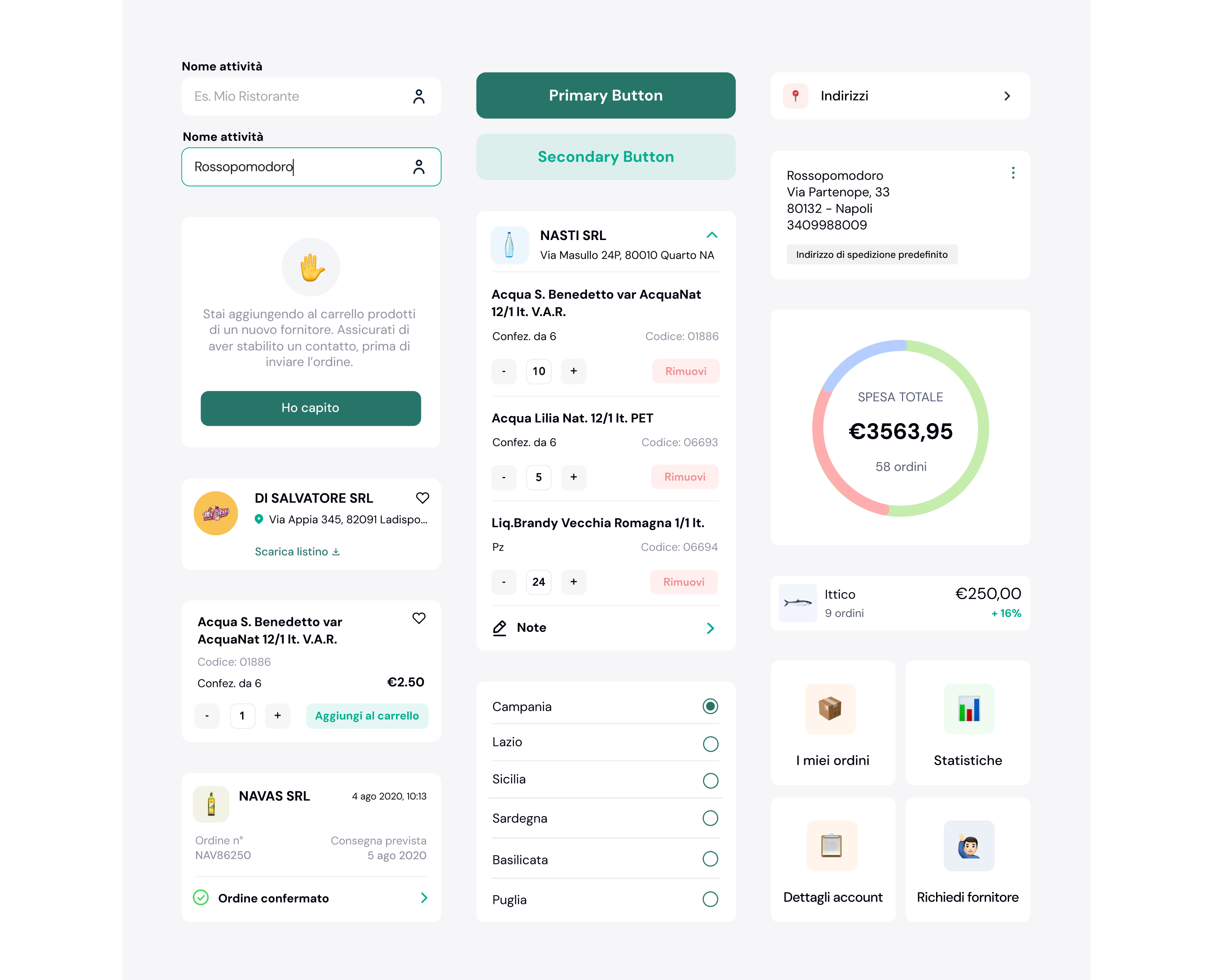
I led the UI & UX design of Ristoply’s mobile app, creating smooth onboarding, intuitive catalog browsing, and a simple flow for placing and confirming orders. I focused on clarity and efficiency, so restaurateurs could manage dozens of suppliers in one place without friction. The result is a sleek, user-friendly tool now used in 35+ cities, turning a messy ordering process into a streamlined experience, with offline access, transparent costs, and an interface that makes supply management easy and enjoyable.
MVP - Minimum Valuable Product: when “less is more” becomes a successful strategy.
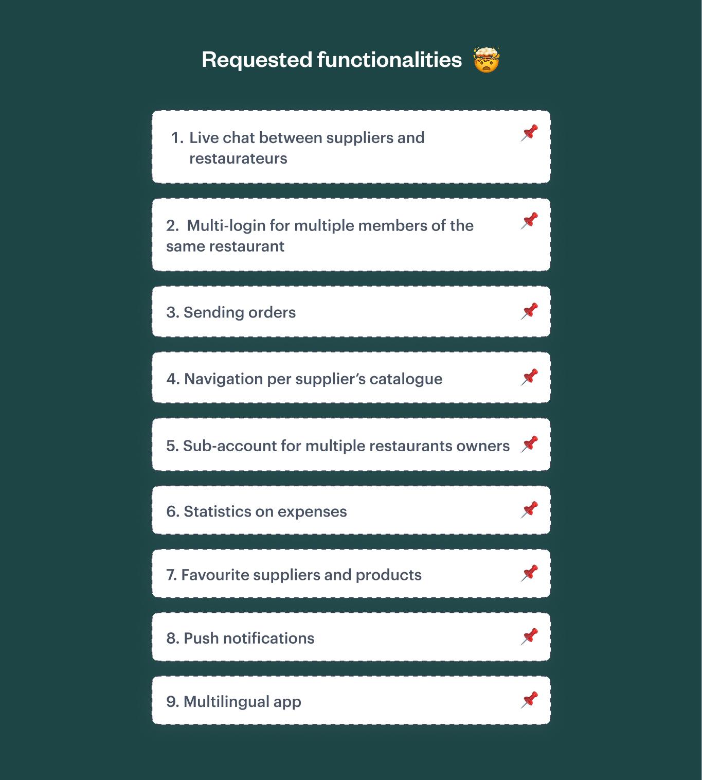
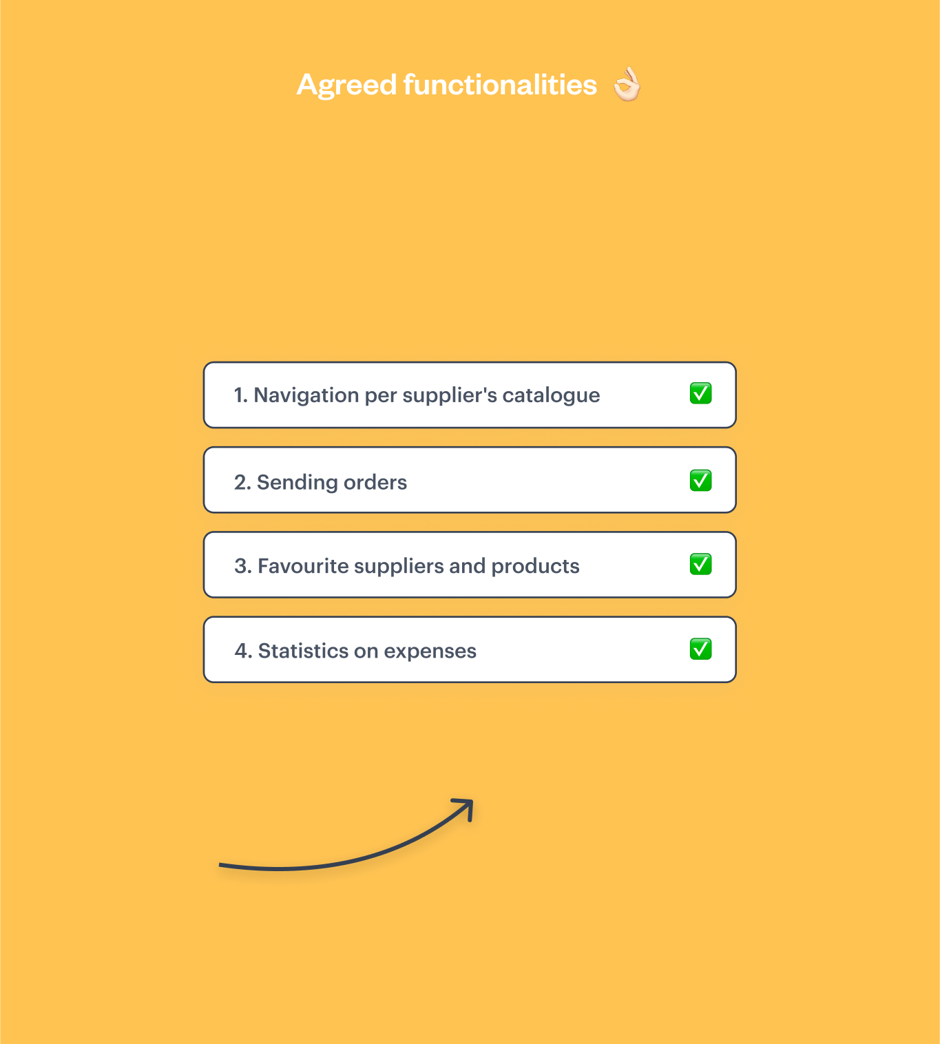
The project began with the Founders’ vision, rooted in their long-standing experience in the HoReCa supply chain. Together with my team, I worked on shaping this idea into an MVP designed to accelerate the digitalization of the B2B agri-food sector. We adopted an agile approach and, through target analysis, I contributed to identifying the most valuable features for the MVP. This made it possible to balance the Founders’ requests with what was truly beneficial for the product. By applying Lean methodology, we ensured that every functionality released added real value and avoided unnecessary complexity for the user. Below, I outline the initial functionalities requested by the client compared to those agreed upon for the product launch.
User journey definition.
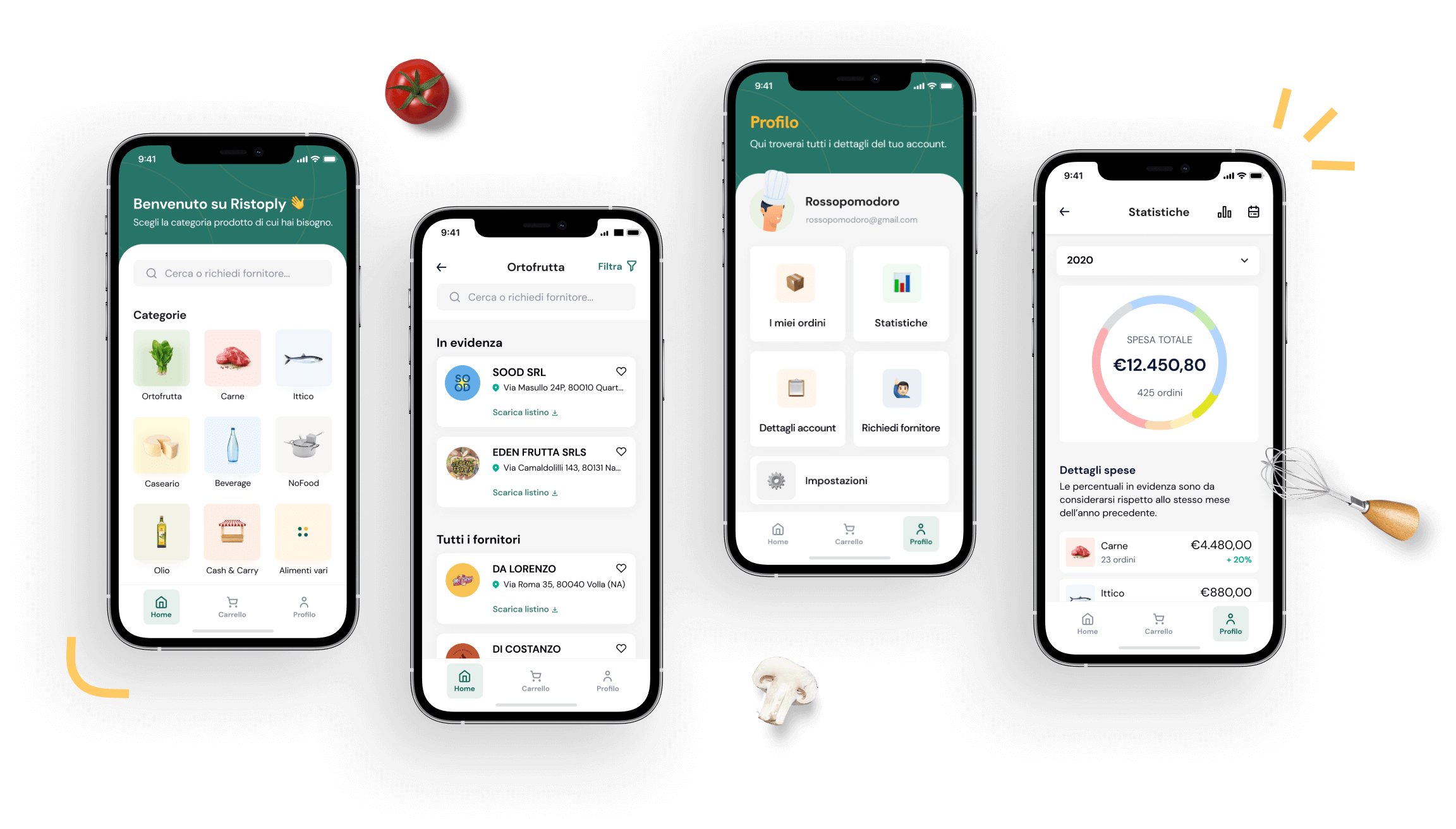
The first product I worked on was the app for restaurateurs. Once the target was defined and all the necessary functionalities were established, I focused on the purchase funnel. I worked with the client to analyze user flows, from the first interaction through to placing the order. After experimenting with more solutions for some micro-flows, I have designed the definitive UX, so that it is fluid and pleasant for the user.
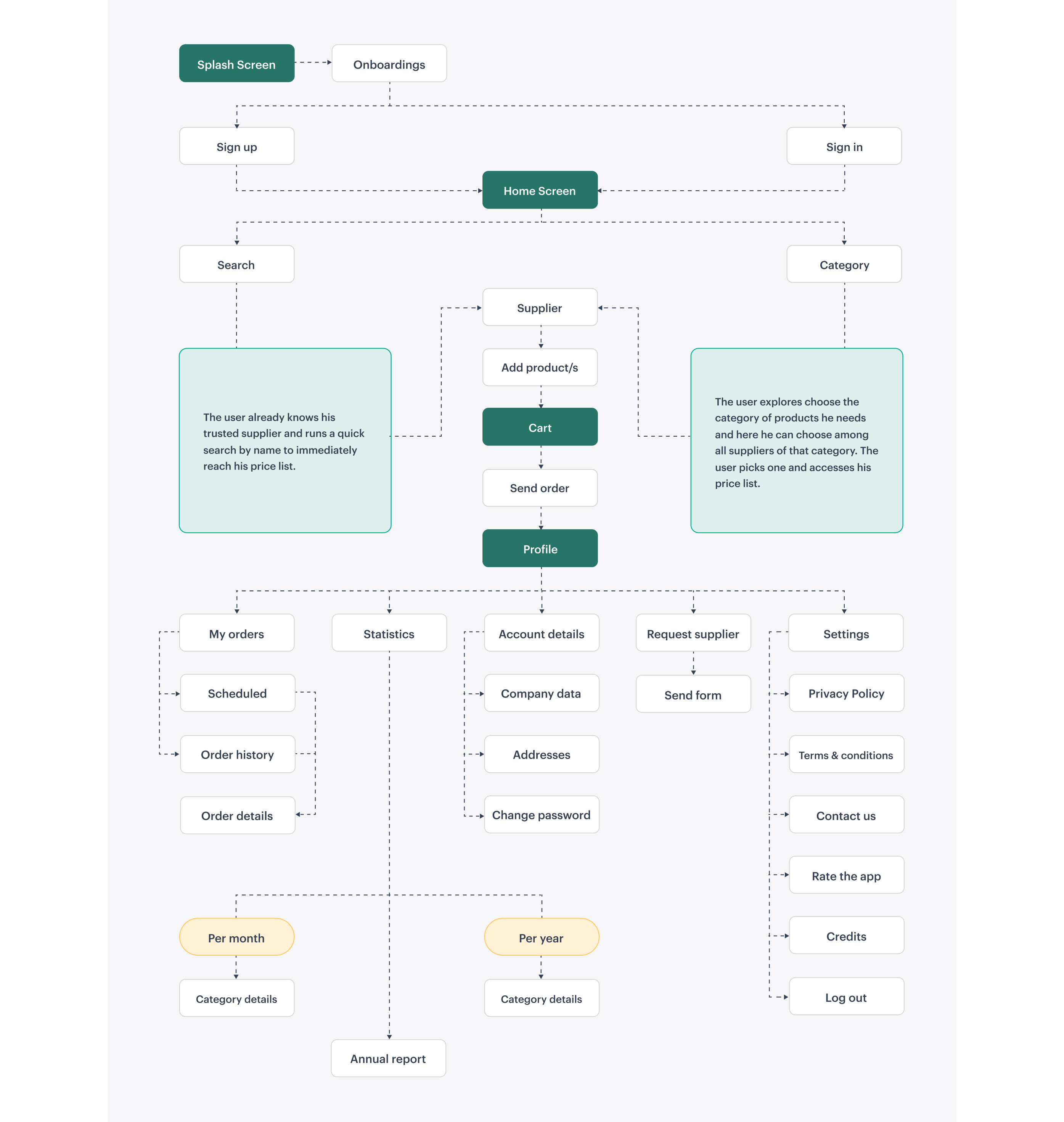
From wireframes to the user interface.
The transition from the flowchart to the wireframe is essential to start visualizing more clearly how the user experience, the management of spaces, and the positioning of CTAs will look like. The next step was defining the UI. Based on the Visual Identity that Ristoply had already defined, I designed a fresh and dynamic interface. I improved some cornerstones of the Brand, such as the color palette. The use of correct typography, custom images, and illustrations have helped to add value to the final product.

UI components: let’s define the style.
Working in a lean way also means facilitating product development. For this purpose, I created a library of components that were used by the Devs Team. Following a clear and consistent style guide makes their work more efficient.
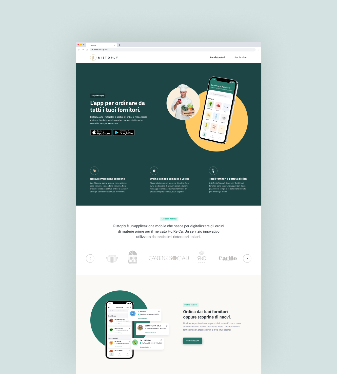
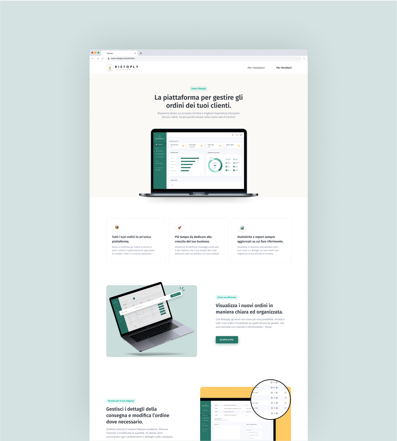
Speed to Market
A new product is always a challenge. How did we measure interest in our solution without a complete product? We have created www.ristoply.com, a landing page dedicated to both restaurateurs and suppliers, which shows the advantages of the service offered. The landing page also contributed to lead generation through its simple contact form. In this way, the Founders were able to acquire contacts of people interested in the product and notify them as soon as the app was available in the stores.